Typical MOQ per SKU: 5k pcs; tiered pricing from 20k+.NDA & compliance support available.
Introduction
Cambodia’s beauty and personal care market has expanded steadily in recent years, supported by rising incomes, urbanisation and a young population that is highly active on social media. Shampoo is one of the most dynamic categories within hair care, with stable demand for both mass-market and premium products, including many imported brands.
In such a competitive environment, packaging design does far more than hold the formula. It communicates function, price positioning and cultural identity at a glance, both on crowded store shelves and in tiny e-commerce thumbnails. Understanding how Cambodian shampoo packaging works – visually, linguistically and legally – is essential for local and foreign brands that want to succeed in this market.
This article explores the main features of Cambodian shampoo packaging and design, from regulatory constraints and cultural cues to emerging trends in sustainability.
1. Cambodian Shampoo Market and Consumers
1.1 Market context
Cambodia’s cosmetics market, which includes hair care, is projected to grow at around 5–6% annually over the coming years, driven by rising disposable incomes, tourism and the influence of regional beauty trends from Korea, Japan and Thailand. Hair care – particularly shampoos and conditioners – is a core daily-use category within this broader market. Professional salon products also contribute to demand, especially in urban centres.
Imported products hold a strong presence, ranging from global multinationals to Korean and Japanese brands, while local and regional labels compete through price and “natural” positioning.
1.2 Consumer behaviour
Several characteristics define Cambodian shampoo consumers:
Youthful demographic – Cambodia has a relatively young population, which tends to be highly engaged with beauty, personal expression and fashion.
Social media influence – Platforms such as Facebook, TikTok and Instagram, along with live-commerce and local e-commerce sites, strongly shape product discovery.
Function-plus-image expectations – Consumers look for clear functional benefits (“anti-dandruff”, “hair fall control”, “colour care”) but are also attracted to aesthetically pleasing packaging that feels modern and “Instagram-mable”.
Growing interest in “clean” and gentle formulas – In line with broader Southeast Asian trends, interest in natural ingredients, mild formulations and “clean beauty” claims is increasing.
These behaviours feed directly into how shampoo packaging is designed and how information is prioritised.
2. Regulatory and Labelling Framework
Shampoo packaging in Cambodia is heavily shaped by labelling and product-safety requirements. Brands that ignore these constraints risk customs issues, fines or removal from shelves.
2.1 Khmer language requirement
Cambodian regulations require that consumer products, including cosmetics, provide key information in Khmer, the official language. Authorities have stepped up enforcement in recent years, clarifying that all products – imported or locally produced – must carry Khmer language information on the label, via printed labels or durable stickers.
For shampoo, this typically includes:
Product name or description
Usage instructions
Ingredients or ingredient category information (where required)
Warnings or precautions, if any
Manufacturer or importer details
Country of origin
Volume or weight
Foreign languages such as English, Korean or Japanese can still appear on pack, but they do not replace the Khmer requirement.
2.2 Cosmetic-specific rules
Cosmetics marketed in Cambodia must also comply with specific regulations from the Ministry of Health. These include product registration, safety assessments and the display of registration numbers on labels, along with a prohibition on misleading claims.
From a design perspective, this means shampoo packaging must reserve space for:
Registration or notification numbers
Legally compliant claims rather than exaggerated promises
Clear, non-deceptive imagery and wording
The regulatory framework therefore directly influences layout, information hierarchy and even font size.
3. Cultural Influences on Cambodian Shampoo Packaging
Beyond legal requirements, cultural expectations and aesthetics strongly shape how shampoo packaging looks and feels in Cambodia.
3.1 Language mixing and brand naming
Many shampoo bottles combine Khmer and English on the same face:
A global or regional brand name may remain in English or Korean for international recognition.
Descriptive phrases such as “Anti Hair Fall” or “Herbal Shampoo” are often duplicated in Khmer so that local shoppers can understand the benefit easily.
Some local brands adopt Khmer names or use Khmer words that signal ideas like “fragrant”, “pure” or “silky” to build emotional connection with domestic consumers.
This multilingual design is one of the most distinctive features of Cambodian shampoo packaging.
3.2 Visual cues and motifs
Common visual cues reflect both local sensibilities and broader Asian beauty trends:
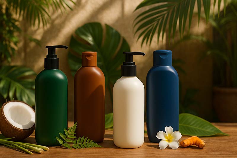
Botanical and food ingredients – Coconut, rice, ginger, turmeric, lemongrass, citrus fruits and herbal leaves appear frequently in illustrations or photography, conveying “natural” and “traditional remedy” messages.
Subtle cultural references – While everyday products rarely use overt religious or temple imagery, some brands incorporate Khmer-style patterns, gold accents or textures reminiscent of traditional crafts to evoke a local premium feel.
Aspirational beauty – Hair visuals, if present, typically show smooth, shiny, healthy hair, often with a soft gradient or light halo to suggest gloss and vitality, mirroring regional advertising styles.
3.3 Colour preferences
Colour choices balance global category codes with local taste:
Green, brown and beige signal herbal, organic or eco-friendly formulas.
Blue and white often suggest “freshness” or “anti-dandruff” efficacy.
Black with gold or metallic details conveys technology, anti-hair-fall strength or salon-grade performance.
Pink and purple tones can position the product as feminine, fragrant or targeted at colour-treated hair.
These colours help consumers quickly identify the function and price tier without reading every line of text.
4. Key Visual Design Features of Cambodian Shampoo Packaging
4.1 Bottle structures and formats
In Cambodia, shampoo appears in a variety of formats that align with consumer budgets and retail channels:
Standard bottles (200–400 ml) – Common in supermarkets and minimarts; often with flip-top caps.
Family-size pump bottles (400–800 ml or more) – Targeted at families and frequent users; pump dispensers add convenience and a more premium feel, echoing regional trends in hair-care packaging.
Professional and salon formats – Larger pump bottles or refill pouches used in salons, often with minimalist, clinical-style graphics.
Travel sizes and sachets – Small bottles and single-use sachets help capture price-sensitive buyers or tourists who want to try products before committing to large volumes.
Designers must make sure branding and claims remain legible across these size variants, including on very small areas.
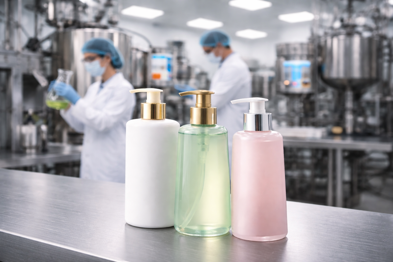
4.2 Colour palettes and finishes
Packaging finishes influence perceived value:
Glossy PET or HDPE bottles dominate in mass-market products.
Matte or soft-touch finishes, combined with muted colours like nude, off-white and dusty green, are increasingly used for “natural” or “premium minimalist” lines, following global hair-care design trends.
Transparent or tinted bottles are popular for products that want to showcase texture or colour (e.g., oil-infused, gel-type or micellar shampoos).
Foil stamping, metallic inks and gradient backgrounds are sometimes used to highlight hero claims or premium sub-lines without dramatically increasing cost.
4.3 Typography and multilingual layout
Typography on Cambodian shampoo packaging needs to solve a complex puzzle: multiple languages, regulatory information and marketing messages all competing for limited space.
Key strategies include:
Bold Latin fonts for brand and key benefit – For example, “HAIR FALL CONTROL” or “HERBAL CARE” in large, easy-to-read English text.
Khmer script for comprehension and compliance – Khmer translations of the main benefits and instructions are placed directly below or beside the English copy, often in smaller size but high contrast.
Hierarchy of information – Designers usually reserve the front panel for brand, product type and one or two hero benefits, pushing long ingredient lists, warnings and detailed directions to the back or side panels.
When done well, this multilingual typography feels balanced rather than cluttered, guiding both local and foreign consumers to the most relevant information.
4.4 Imagery, icons and symbols
Imagery plays an important role in overcoming language barriers and low-involvement shopping:
Ingredient imagery – Photorealistic fruits, seeds, oils or herbs communicate benefits like nourishment, anti-dandruff action or scalp soothing at a glance. Global design references show how such imagery is often paired with simple bottle shapes and bright, clean backgrounds.
Benefit icons – Simple pictograms (e.g., shield for protection, droplet for hydration, scalp silhouette for anti-hair-fall) help shoppers decode benefits quickly.
Certification or claim badges – Logos indicating “SLS-free”, “paraben-free”, “organic ingredients” or “dermatologist tested” are increasingly visible on regional packaging, including in Cambodia, as consumers become more ingredient-aware.
These graphic tools make the pack feel informative and trustworthy without overwhelming the layout with text.
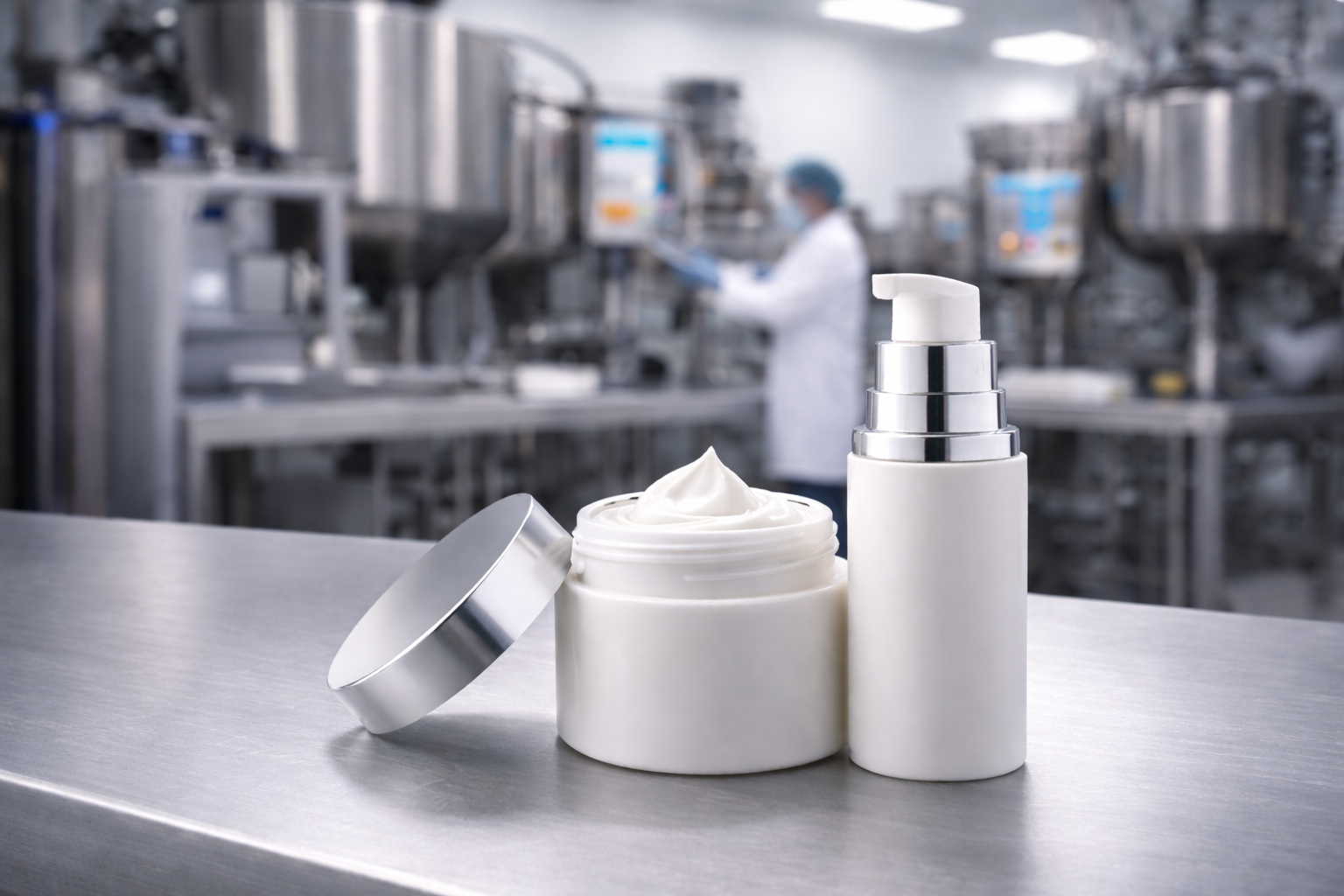
4.5 Materials and structural sustainability
Most shampoo bottles in Cambodia are still made from PET or HDPE plastics, chosen for durability, chemical resistance and affordability. Some brands highlight recyclability by including common recycling symbols or stating that the bottle is made from recyclable plastic, reflecting broader global initiatives in cosmetic packaging.
Cardboard outer boxes are less common for mass-market shampoos due to cost and waste concerns, but they appear for gift sets, premium lines or travel kits where unboxing experience matters.
5. Sustainability and Eco-Friendly Packaging Trends
Sustainability is not yet the primary driver of purchase for all Cambodian consumers, but global and regional trends are clearly influencing expectations.
5.1 Growing awareness of green cosmetic packaging
Studies on cosmetic packaging show that green materials and eco-conscious design can positively influence consumer preference and purchase intent, especially among younger, more educated shoppers.
Global surveys also indicate that:
A large majority of consumers are more likely to buy from brands with sustainable packaging.
Many expect brands to reduce plastic usage, even if they still accept recyclable plastic as a practical compromise.
These attitudes are increasingly relevant for Cambodian urban consumers connected to global media and environmental conversations.
5.2 How this appears on Cambodian shampoo packaging
Practical expressions of sustainability in shampoo packaging include:
Use of recyclable plastics with clear on-pack recycling symbols.
Reduction of unnecessary secondary packaging, such as individual cardboard cartons for standard bottles.
Refill strategies, such as larger refill pouches or bulk containers for salons and households.
Natural and “clean” design language, using earthy colour palettes, minimal graphics and botanical imagery to signal eco-friendliness, even when the materials themselves are conventional plastics.
Brands that invest in genuinely sustainable materials – such as higher-recycled-content plastics or bio-based components – can use packaging as a storytelling platform to justify slightly higher prices.
6. Design Considerations for International Brands Entering Cambodia
For overseas brands planning to enter the Cambodian shampoo market, packaging design must integrate global brand equity with local expectations.
6.1 Language and compliance
Include Khmer translations for all required information – product name/description, instructions, ingredients (where applicable), warnings, manufacturer/importer details, origin and volume – to comply with labelling rules.
Decide whether to print multilingual labels directly on pack or to use durable, well-designed stickers. Aesthetically integrated stickers look more premium than rushed, tiny add-on labels.
Ensure any claims and imagery are consistent with Cambodian cosmetic regulations and do not imply unrealistic medical results.
6.2 Cultural and aesthetic fit
Localise through ingredients and visuals, not stereotypes. Highlight botanicals and benefits relevant to Cambodian hair concerns (e.g., sun exposure, humidity, pollution) instead of relying on clichéd temple or Angkor silhouettes.
Balance global minimalism with enough information density. While very sparse packaging may look luxurious, Cambodian mass shoppers often expect to see clear claims and usage information on the front.
6.3 Channel-specific design
For modern trade (supermarkets, minimarts), focus on strong colour blocking and clear brand marks visible from a distance on crowded shelves.
For traditional trade (small shops and kiosks), assume products may be displayed behind glass or partly hidden; large, high-contrast typography for the brand and key benefit helps.
For e-commerce and social media, ensure the pack reads well at small sizes: simple shapes, big logos and one or two concise benefit phrases.
6.4 Price positioning and structural choices
Match bottle size, closure type and finish to your price tier. Pump dispensers and matte finishes can support a more premium perception, but they must not push the final price far beyond local competition.
Consider offering both entry-level trial sizes and larger refills to meet a variety of budgets.
7. Illustrative Packaging Approaches
To make these ideas more concrete, imagine a few typical positioning strategies for Cambodia:
Herbal local-premium shampoo
Bottle: Matte dark green PET with pump dispenser.
Graphics: Minimal line drawings of rice and lemongrass; small gold Khmer pattern band near the base.
Text: English brand name + large “Herbal Hair Fall Control Shampoo”, with Khmer translation directly below; back label lists key herbal extracts and usage in Khmer and English.
Mass-market anti-dandruff shampoo
Bottle: Glossy blue HDPE, standard flip-top.
Graphics: Wave or cooling droplet imagery; “Anti-Dandruff Cooling Menthol” in big English text plus Khmer description.
Emphasis on visible volume (“650 ml family size”) and strong price-value message.
Eco-positioned gentle shampoo for sensitive scalp
Bottle: Semi-transparent clear PET to show colourless formula; simple cylindrical shape.
Graphics: Soft beige label with minimalist typography, recycling symbol and brief sustainability claim (e.g., “Bottle made with 50% recycled plastic”).
Claims: “Fragrance-free”, “SLS/SLES-free”, “Dermatologist tested” with icons, again in both English and Khmer.
Though hypothetical, these scenarios show how structure, colour, typography and language choices combine to communicate both global and local cues.